In which someone asks a question on the SCA Japanese FB page and scrambles my brain. HE Baron Akitsuki Yoshimitsu asked about the translation of a certain modern piece of Chinese calligraphy, dated 1958, by Wing Gig Fong, a Chinese-American artist.
Here’s the piece, which is owned by the Smithsonian institution. You can see the piece here on their webpage.
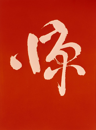
Wah…abstract modern sosho! My brain! The top character is almost certainly 少 (ON: shou KUN suku/suko) which means few, little. Which makes sense as the original Chinese for the phrase the piece was named was 少则得多则惑 “He who obtains has little, he who scatters has much”). But the second one has me puzzled. Maybe 不 (ON: fu KUN: zu) which means un-, non-. But while 少不 is not a really a word, 不少 (fushou) in Japanese means “not many” while 不少 ((bùshǎo) in Chinese means “a lot of”. It could be the artist is punning and including a little and a lot in the same piece. But I’m really stretching here and could be completely wrong. Sorry I can’t be of more help.
It’s certainly not a name or anything. Considering that it is a 20th century abstract piece, I don’t think I’m too far off in my guess of its meaning. But again, not sure on the lower kanji, and I do Japanese, not Chinese. (Any Chinese I know is second-hand through my Japanese studies, and I can’t pronounce it AT ALL.)
Anyway, that killed about two hours of my day. It’s so frustrating! I got to take an intensive Japanese course about 13 years ago, and have tried to learn on my own since then, but self-study is not easy, and my chances of doing the immersive thing and staying in Japan for 6 months to a year are nada.
If I am completely off base here, please comment and let me know. It’s the only way to learn!
A few notes here: modern sosho can be quite different from classical sosho, which tends to be very thin and whispy. The style I study with my shodo teacher, which was taught by the calligraphy master Kampo Harada-sensei, tends to be of a modern bent. For SCA purposes, most of the styles (tensho, reisho, kaisho, and gyousho) are not far off, but Kampo’s sosho was very stylized and modern. He could do the classical style, of course, but a lot of what I’ve seen of his own work has a very mid-20th century feel. It’s beautiful, but something to keep in consideration if you are working on a Japanese scroll for SCA–try to work off of pre-16th century examples. Copperplate is a beautiful hand for Roman-style letters, but not something the SCA would use in a scroll since it is more 18th-19th century. Same applies here.
